From what I've been able to find out, "The Sycamore Gap" tree is well known outside of the UK. Located beside Hadrian's Wall in Northumberland, England, it gained global fame partly due to its appearance in the 1991 film Robin Hood: Prince of Thieves. International condemnation was widespread when the 150-year-old tree was deliberately and illegally cut down in September 2023.

A while ago there was a discussion in my Art Forum about drawing trees and how most people felt they couldn't really draw or paint them properly. In response, by way of providing an opportunity for some practice, I decided to choose a tree as the subject for the forums next Monthly Painting and Drawing Project, and what better specimen than the famous Sycamore Gap tree.
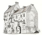
Though most members reached for their watercolours or coloured pencils, I reached for my Pigma Micron Pens. I'm very pleased with the resulting drawing but keep thinking I ought to splash some green watercolour on it. I've resisted so far.