Thursday 21 May 2015

Web sites and stuff.

Good grief, it's been over 2 months since I last posted .... doesn't time fly when you're working your socks off? LOL.

As most of us know, it's that time of year when our gardens beckon and anyone with a 'formal' garden will know just how much post-winter tidying up and spring weeding, trimming and pruning is necessary. My greenhouse is bulging at the seams both with tender plants that have overwintered in there, and with new plants born from cuttings. I'm an old fashioned gardener so won't plant out any tender plants before the end of May. Nearly there!!!

We have also decided to have a new kitchen so remodelling has also been high on the agenda. I'm needing to finish painting the hall and passageway now that our new Front and back doors have been fitted but progress is being made as I spend sunny days outside and wet ones inside. Sometimes I feel like the little man in one of those old Swiss Weather Cottage ornaments. LOL.

On top of everything else I've also been fixing my web site - JWJonline. Google recently announced that they would be giving less importance in their search results to sites that were not 'Mobile Friendly'. They use all sorts of complicated expressions like 'Responsive Design' but what it really comes down to is a flexible layout that looks good on any size screen. At first I ignored this 'advice' but eventually looked closely at the statistics for my site and found that my traffic is fairly equally split three ways, one third from phones, one third tablets and one third desktops, This is a massive change even over the last 12-months.

With 2/3rds of my traffic coming from mobile devices I decided I had to deal with the matter. For template-based sites run by hosting companies there is little the end-user can do to alter the technical structure of the site but for someone who has built their own site from scratch, as I have, the ball is firmly in my own court. It's been necessary to look up lots of things and my learning curve has been steep, but I'm there now and very happy with the results ..... fonts rescale, images rescale and text moves fluidly around the screens. Whether you view my site on a phone, tablet or desktop, the pages ought to look good. (Let me know if you see something that could be improved). I have to applaud Google for providing some extremely useful tools especially one that allows a desktop user to see how his site looks on any other device.

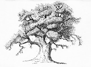
So, while all of this has been going on I haven't been able to do much art. I've occasionally spent a little time doing ink sketches, such as this tree, old rowing boat and village green, just to keep my hand in, but 'serious' art has had to take a back seat. Still, summers almost here, the web site is virtually finished, the garden will soon be looking after itself and the kitchen won't take forever, and then I'll be out in the summer sun with my sketchbook as I'm determined to do some urban sketching this year.

Thursday 12 March 2015

Eilean Donan Castle


You may recall from my last post that I did a practice piece of this castle a few weeks ago. Since then I've been working on the drawing proper. This is much larger than I usually work (on 16" x 12" Daler-Rowney Heavyweight paper) and it's surprised me as to how much longer a large drawing takes compared to a smaller one. I suppose it should have been obvious but there's a lot of little pen marks in this drawing. A picture twice the size seems to have taken 8 times longer to do.

Another 'first' for me was that I used several reference photo's. With shadows, lack of colour and a flat grainy photograph I found some of the details difficult to put into perspective, but having several photo's taken at different times of day and from different viewpoints enabled me to get a better understanding of how the various walls and buildings fit together.

As I stated in my previous post, this particular view of the castle isn't quite balanced as the bridge runs out too far to the right leaving a large empty space to the right of the castle. I had intended to use artistic licence to insert a tree into that space to balance things up but I've changed my mind and cropped the picture to exclude one of the bridge spans. A few birds in the empty space adds some balance.

I'm really pleased that I did the practice piece (something else I don't usually bother with) as it helped me understand which hatching/shading worked and which didn't. I didn't want to make the hatching obvious and believe that if done right it should blend seamlessly into the whole.

For anyone interested I've put a Work In Progress page on my main website showing the various steps.

Friday 27 February 2015

Practice makes perfect?

Following my recent small Pen & Ink drawings I wanted to try something more ambitious and decided to attempt this Mill which sits on the River Avon at Tewkesbury. The Mill is mainly brick built but the centre structure on legs, the small attic rooms and the small building to the right (also on legs) are made of white painted timber. The roofs are tiled and the water is wet. Regrettably I messed it up within the first couple of pen strokes but I'd spent so long drawing it out in pencil I hadn't got the heart to scrap it and start again so decided to use it as a practice piece. I wanted to better understand how to using hatching to depict brickwork, timber, tiles, water and so on, so a few wonky roof lines and wobbly windows weren't going to make a lot of difference to my learning process. Apart from the bad bits I'm not displeased with it and it was certainly a fabulous piece to practice on. The hatching and shading disguised a multitude of sins and I learned a great deal from doing it.


My next piece was specifically done as a practice piece. One of my all time favourite places even though I haven't been there yet (it's on my bucket list) is Eilean Donan Castle in Scotland. I've decided that I'd like to draw it in Pen & Ink but to do justice to it, I think it needs to be a large drawing so as to allow for plenty of detail. To enable me to appreciate how best to hatch in the darks and shadows and to aid in the overall composition of the drawing, I decided to do a smaller (10" x  8") practice piece.

As usual, some of my verticals aren't vertical but that doesn't stop the practice piece from serving it's purpose very well. This particular composition is too wide. I don't like the way the bridge hangs out on it's own to the right, yet I feel the bridge is an important feature. I'll look at other options but I'm thinking artistic licence could bless me with a large Oak tree to the right of the castle. I'm pleased with the shading of the end gable of the building on the left but many other areas don't work as well as I'd hoped. I didn't want to overdo the diagonal hatching and I've achieved that, and I've also achieved a 'stone' appearance to the castle, however I think I need to have another practice run to try out some other effects.

They say "Practice makes perfect". It doesn't always ..... but it sure as heck helps. ;-)

Thursday 19 February 2015

Exploring is Fun!!

After my first couple of efforts with pen & ink 'hatching' I was determined to find out more about types of hatch and how to hatch. It quickly became apparent that it's not just a case of laying down lots of parallel lines. The direction of hatch, the tightness of the hatch, whether or not the lines are straight or curved, and a score of other factors all contribute to whether the shaded area looks natural or not. So, to that end, I'm exploring 'hatching' in particular and pen and ink work in general.


I'd taken a photograph of this Castle Door when visiting York Castle many years ago and gave me a chance to show the different textures between the wooden door and the old worn stonework.


This is the Town Hall (and Museum) in Royal Wootton Basset. Built in 1690 it is in a mock Tudor style and stands on 15 stone pillars. No rough stone in this one but the roof provided a different texture for me to try.


For something completely different I attempted a flower. I don't think the delicacy of the Tulip shows through but I'm pleased with it's overall shape and form.


This old Yorkshire Lime Kiln provided an opportunity to just run riot with the hatching and was great fun. Back in 2011 I attempted this same drawing also in pen and ink but the results were very poor. My effort back then made it look as if the kiln had been painted with camouflage stripes. I'm much happier this time and very pleased that I've made some progress.


Exploring any new medium/method/technique is all about trying things out and taking note of what does work and what doesn't. There's no doubt that I'm really enjoying pen and ink right now, even the things that didn't work quite as I'd hoped.


Thursday 12 February 2015

Pen & Ink

I love Pen & Ink studies but have never been very good at them myself. I think the main problem is the hatching. I'm never sure which way to hatch, when to cross-hatch, and which direction to hatch in. Some of my early attempts looked like camouflaged zebra's playing twister. Anyway, since my last 4 or 5 drawings have been detailed pencil work taking quite a long time I decided to let my hair down (what bit I have left) and have another go at Pen & Ink.

This first drawing is of a small building I came across in a farmers field in Wales. I have no idea what it is used for. The pallet leaning against it gives an idea of scale and there's barely enough headroom to stand up inside. I used a set of 5 Pilot DR drawing pens for this one.

Having heard good reports about Pigma Micron Fineliners I ordered a set of 6 in different sizes. They dropped onto my doormat with this mornings mail and I was keen to try them out. The subject I chose was this small dry-stone wall that I saw in the Snowdonia National Park in Wales. I can't say I noticed a great deal of difference between these pens and the ones I used for the previous drawing ... they seem equally as good.

I feel as if I'm beginning to make a little more sense of the hatching now and I guess it's like everything else .... practice makes perfect. I really need a lot more practice but these are so quick and enjoyable that shouldn't be a problem. lol.

Thursday 5 February 2015

Famous Pair.

A couple of weeks ago I posted that I'd been working on something special as a gift and that I wouldn't post it online until it had been finished and delivered. Well I'm just back home from doing just that so now I can safely display the piece.


My brother-in-law is a keen model railway enthusiast and I decided I'd like to draw a train engine for him. I searched the net for railway engines that I know he's fond of and found two of his favourites. I happened to have a wide, narrow frame that I thought lent itself perfectly to a train, however, when I came to compare various pictures with the frame I couldn't find anything that I felt happy with. After a lot of hunting around and head scratching I had the idea of using BOTH trains in the same picture.

Since the picture is about the engines I chose not to include any background or foreground and, in my opinion, the wide, narrow format makes the images look more dramatic than they would have done individually and the backward sweeping smoke provides a sense of movement.

For any rail enthusiasts, the engine on the left is "6100 Royal Scot", the first of the 4-6-0 Royal Scot Class express passenger locomotives. Introduced in 1927, like many engines it has experienced many upgrades and rebuilds, and this is how it looked in the mid-1950's. The class was withdrawn from service in the early 1960's. The engine on the right is "4468 Mallard", a Class A4 4-6-2 Pacific steam locomotive. Built in 1938, Mallard holds the world speed record for steam locomotives of 125.88 mph. It was withdrawn in 1963 after almost 1.5 million miles of service. Mallard went through several redesigns and liveries which saw it with streamlined 'skirts' over it's wheels, twin tenders and double funnels. It is currently on display at the National Railway Museum in York.

Sunday 25 January 2015

Snowdrops

Since my last dogs portrait I've been working on something much more difficult and, surprisingly, demanding much closer attention to detail. It's taken a couple of weeks to do but I can't say any more about it because it's something I've drawn as a gift for someone. I doubt that they would ever visit my blog but I'm going to err on the side of caution and not post the piece here yet. I'm excited about what I've done and am bursting to show you all ..... but it'll have to keep for another couple of weeks.

In the meantime I thought I'd show you my Snowdrops. I am blessed with a garden that oozes Snowdrops at this time of the year and they grow just about everywhere ... in the lawn, in the flower borders, in the gravel driveway and even in crevices between rocks. As a keen photographer I'm always trying to get that perfect shot of them and I must have hundreds of photos. Here is just a small selection together with my latest attempts at both painting and drawing them.

Oh, if any of you want Snowdrop reference photo's for your artwork just let me know and I'll look at the high-resolution originals for you. ;-)


Wednesday 7 January 2015

Flamborough Lifeboat 1971


In my last post I mentioned that I was excited about a new drawing I was working on, well this is it.
A few weeks ago, I stumbled across a black and white photograph of the Flamborough Lifeboat leaving Bridlington Harbour in 1971. I had recently picked up my pencils and was working on a drawing of a pair of dogs and was enjoying being back at my drawing board. Something about this picture sparked an enthusiasm in me that I don't think I've experienced before and I just knew I had to draw it. I sent an email to the photographer, Paul Berriff and sought his permissions for me to use his photograph, which he gladly gave.

I used artistic licence to remove a harbour wall that occupied the left quarter of the original photo as I wanted to emphasise the isolation and peril that these brave men find themselves in whenever they go out in stormy weather. Somehow the harbour wall gave the impression they were still in a safe haven. As a result of this decision the waves on the left are somewhat invented, but I think they add to the overall mood of the scene and increase the drama.

I can't remember a time when I've been so excited about doing a drawing and to say I was buzzing is an understatement. I think I may do another of these in the not too distant future .... I just have so many other things I'm anxious to try.

For anyone interested I have put a Work In Progress page on my main website showing the various stages.


Tuesday 6 January 2015

New year, new beginnings

Happy New Year to all my blogging friends. ;-)

For me, 2014 wasn't a great year. It started with me packing up my parents belongings and selling their home of nearly 50 years, helping them to move away from the town they've lived in for almost all of their 68 years of marriage. They now live 130 miles away with my sister, and whilst that has been the best result for them, it has been difficult for all concerned .... and I miss having them nearby. They have both had periods of illness that involved many journeys up and down the motorway visiting them and providing support to my sister. Sadly Dad passed away in October. He was 96 and suffering with Alzheimers, so in many ways it was a blessing I think. Mum has had more than her fair share of problems but, at this time, she is doing very well.

My art will never be more important to me than family and so it has been on the back burner. There have been periods during the year where I've found myself with the time to pick up my brushes or pencils, but I just haven't been able to get excited about painting or drawing anything. Sure, I've tried, and there have been times when I've made a determined effort to get back into my art, back into blogging, and back into following what the rest of you are doing. But those times have been very short-lived.

Just before Christmas my aunt, during a brief pre-Christmas visit, saw the pencil portrait of my two dogs hanging on the wall of my lounge and asked if I'd drawn it. When I said I had she wasted no time in asking me if I'd do a similar drawing of her daughter-in-law's two dogs. Though she wanted to give the drawing as a Christmas gift, she wasn't concerned if it wasn't ready in time. With some trepidation, I agreed.

My cousin, a co-conspirator, sent me a number of reference photo's and I set to work just before Christmas, finishing the drawing around the New Year. On Sunday we all went out for a family meal and the drawing was handed over. The reaction was out of this world and I couldn't be more pleased with the way the portrait was received.


As I drew the dogs I felt myself buzzing .... enjoying every moment .... and thinking about what to draw next. Many times I've been asked if I have made any New Years resolutions and I always say "No", because I don't do that. However, something inside me is telling me that 2014 has finished and that 2015 is going to be a much better year. And so it is that as soon as the dog portrait was finished I put a clean sheet of paper on my drawing board and started the next one. It's my most ambitious yet ... I'm buzzing with excitement .... loving every minute of it .... and it's almost finished.

I think 2015 might bring me renewed enthusiasm for my art and I hope it brings you whatever you're wishing for too. 

Thursday 13 November 2014

Paynes Grey


A long time ago, an extremely accomplished artist I know told me not to use Paynes Grey but to make my greys using other colours, especially if needing it for shadow work. As time went on I found I was seeing this advice more and more but I couldn't stop using Payne's Grey as I found it such a useful addition to my palette.

One day I discovered the work of James Fletcher-Watson and just had to buy one of his books. With interest I read about his usual palette and was thrilled to find that it always included Paynes Grey. From that point on I stopped worrying about having it in my palette on the basis that if it was good enough for James Fletcher-Watson then it was more than good enough for me.

A couple of months ago, while catching up with my old issues of "Paint" I was taken by an article in the March 2013 edition by artist Alan Goodall. The article is actually about the All Weather Wonderpad, but my interest was more with his subject and technique. His featured painting was a Pen & Wash but he only used one colour ... Paynes Grey. His washes were built up by adding multiple layers of varying strengths and I felt compelled to attempt this myself.

So here is my version of the scene at Watendlath in the Lake District. This was a really useful tonal exercise and I thoroughly enjoyed building up the values layer by layer. I don't know whether it's my love of pencil work that makes me biased towards graphite shades but I'm really pleased with the way this grey monochrome painting has turned out. And yes, Paynes Grey will always have a place in my palette. ;-)