Yesterday I came across a photograph of a small snow-covered cottage and, while thinking about how it might be drawn using pen & ink, realised that it was a great subject to work with both zero-hatching and 'lost and found' lines. Of course, the secret to drawing snow is more about what you don't draw than what you do.
Hoping to inspire and encourage those interested in drawing or painting to have-a-go.
Wednesday 28 October 2015
Snowy Cottage
Yesterday I came across a photograph of a small snow-covered cottage and, while thinking about how it might be drawn using pen & ink, realised that it was a great subject to work with both zero-hatching and 'lost and found' lines. Of course, the secret to drawing snow is more about what you don't draw than what you do.
Thursday 15 October 2015
Canal Cottages
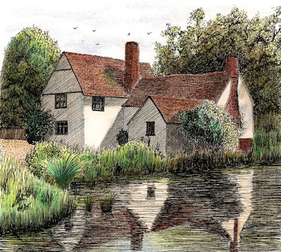
In my last post I mentioned how I was concerned over my use of hatching, in particular that it looks unnatural .... rigid, clinical diagonal lines ... and this is probably down to my inexperience. To explore this further I decided I ought to try a pen drawing with no hatching, achieving tones in a different, more natural way. I've painted this scene before and it struck me as being ideal for my purpose. I'm not displeased with the result and am happy that there's not one area of regular hatching. Now I'm keen to try another. ;-)
Monday 5 October 2015
Tempus fugit and all that.
It's been over 4-months since I last posted. In my last post I mentioned that summer was almost here, and as I write this I can't help but notice that it's now over. I also note that my last post said I was determined to do some urban sketching this summer but I've failed miserably and haven't ventured out with my sketchbook once. What happened to the summer?
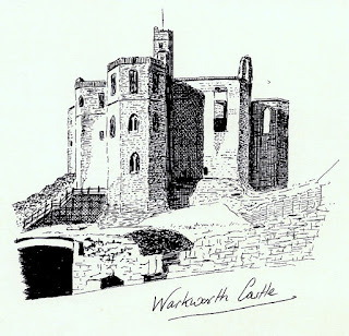
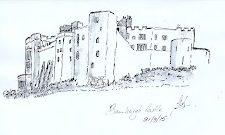
That said, I am recently back from a wonderful holiday in Northumberland during which I succeeded in sketching en plein air on several occasions. I sketched Bamburgh Castle in the rain, the Millenium Bridge in Newcastle in the sunshine and Lindisfarne Castle on a dry but cold and windy day. Yep, British weather at it's best. The sketch of Warkworth Castle was a bit of a cheat as I used a tourist leaflet as a source of reference.
Pen and Ink seems to be my preferred medium at this time and I'm keen to progress it. Although I'm feeling much more competent with the medium than I ever did with watercolour I still feel that my marks, especially hatching, have a 'novice' look to them. Hopefully, the more I do, the more 'natural' the marks will look. With fingers crossed I shall march onwards and upwards as this is a medium I'm really feeling at home with. ;-)
Thursday 21 May 2015
Web sites and stuff.
 Good grief, it's been over 2 months since I last posted .... doesn't time fly when you're working your socks off? LOL.
As most of us know, it's that time of year when our gardens beckon and anyone with a 'formal' garden will know just how much post-winter tidying up and spring weeding, trimming and pruning is necessary. My greenhouse is bulging at the seams both with tender plants that have overwintered in there, and with new plants born from cuttings. I'm an old fashioned gardener so won't plant out any tender plants before the end of May. Nearly there!!!
We have also decided to have a new kitchen so remodelling has also been high on the agenda. I'm needing to finish painting the hall and passageway now that our new Front and back doors have been fitted but progress is being made as I spend sunny days outside and wet ones inside. Sometimes I feel like the little man in one of those old Swiss Weather Cottage ornaments. LOL.
On top of everything else I've also been fixing my web site - JWJonline. Google recently announced that they would be giving less importance in their search results to sites that were not 'Mobile Friendly'. They use all sorts of complicated expressions like 'Responsive Design' but what it really comes down to is a flexible layout that looks good on any size screen. At first I ignored this 'advice' but eventually looked closely at the statistics for my site and found that my traffic is fairly equally split three ways, one third from phones, one third tablets and one third desktops, This is a massive change even over the last 12-months.
With 2/3rds of my traffic coming from mobile devices I decided I had to deal with the matter. For template-based sites run by hosting companies there is little the end-user can do to alter the technical structure of the site but for someone who has built their own site from scratch, as I have, the ball is firmly in my own court. It's been necessary to look up lots of things and my learning curve has been steep, but I'm there now and very happy with the results ..... fonts rescale, images rescale and text moves fluidly around the screens. Whether you view my site on a phone, tablet or desktop, the pages ought to look good. (Let me know if you see something that could be improved). I have to applaud Google for providing some extremely useful tools especially one that allows a desktop user to see how his site looks on any other device.

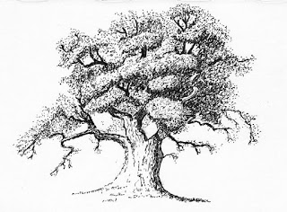
So, while all of this has been going on I haven't been able to do much art. I've occasionally spent a little time doing ink sketches, such as this tree, old rowing boat and village green, just to keep my hand in, but 'serious' art has had to take a back seat. Still, summers almost here, the web site is virtually finished, the garden will soon be looking after itself and the kitchen won't take forever, and then I'll be out in the summer sun with my sketchbook as I'm determined to do some urban sketching this year.
Thursday 12 March 2015
Eilean Donan Castle
You may recall from my last post that I did a practice piece of this castle a few weeks ago. Since then I've been working on the drawing proper. This is much larger than I usually work (on 16" x 12" Daler-Rowney Heavyweight paper) and it's surprised me as to how much longer a large drawing takes compared to a smaller one. I suppose it should have been obvious but there's a lot of little pen marks in this drawing. A picture twice the size seems to have taken 8 times longer to do.
Another 'first' for me was that I used several reference photo's. With shadows, lack of colour and a flat grainy photograph I found some of the details difficult to put into perspective, but having several photo's taken at different times of day and from different viewpoints enabled me to get a better understanding of how the various walls and buildings fit together.
As I stated in my previous post, this particular view of the castle isn't quite balanced as the bridge runs out too far to the right leaving a large empty space to the right of the castle. I had intended to use artistic licence to insert a tree into that space to balance things up but I've changed my mind and cropped the picture to exclude one of the bridge spans. A few birds in the empty space adds some balance.
I'm really pleased that I did the practice piece (something else I don't usually bother with) as it helped me understand which hatching/shading worked and which didn't. I didn't want to make the hatching obvious and believe that if done right it should blend seamlessly into the whole.
For anyone interested I've put a Work In Progress page on my main website showing the various steps.
Friday 27 February 2015
Practice makes perfect?
Following my recent small Pen & Ink drawings I wanted to try something more ambitious and decided to attempt this Mill which sits on the River Avon at Tewkesbury. The Mill is mainly brick built but the centre structure on legs, the small attic rooms and the small building to the right (also on legs) are made of white painted timber. The roofs are tiled and the water is wet. Regrettably I messed it up within the first couple of pen strokes but I'd spent so long drawing it out in pencil I hadn't got the heart to scrap it and start again so decided to use it as a practice piece. I wanted to better understand how to using hatching to depict brickwork, timber, tiles, water and so on, so a few wonky roof lines and wobbly windows weren't going to make a lot of difference to my learning process. Apart from the bad bits I'm not displeased with it and it was certainly a fabulous piece to practice on. The hatching and shading disguised a multitude of sins and I learned a great deal from doing it.
My next piece was specifically done as a practice piece. One of my all time favourite places even though I haven't been there yet (it's on my bucket list) is Eilean Donan Castle in Scotland. I've decided that I'd like to draw it in Pen & Ink but to do justice to it, I think it needs to be a large drawing so as to allow for plenty of detail. To enable me to appreciate how best to hatch in the darks and shadows and to aid in the overall composition of the drawing, I decided to do a smaller (10" x 8") practice piece.
As usual, some of my verticals aren't vertical but that doesn't stop the practice piece from serving it's purpose very well. This particular composition is too wide. I don't like the way the bridge hangs out on it's own to the right, yet I feel the bridge is an important feature. I'll look at other options but I'm thinking artistic licence could bless me with a large Oak tree to the right of the castle. I'm pleased with the shading of the end gable of the building on the left but many other areas don't work as well as I'd hoped. I didn't want to overdo the diagonal hatching and I've achieved that, and I've also achieved a 'stone' appearance to the castle, however I think I need to have another practice run to try out some other effects.
They say "Practice makes perfect". It doesn't always ..... but it sure as heck helps. ;-)
Thursday 19 February 2015
Exploring is Fun!!
I'd taken a photograph of this Castle Door when visiting York Castle many years ago and gave me a chance to show the different textures between the wooden door and the old worn stonework.

This is the Town Hall (and Museum) in Royal Wootton Basset. Built in 1690 it is in a mock Tudor style and stands on 15 stone pillars. No rough stone in this one but the roof provided a different texture for me to try.

For something completely different I attempted a flower. I don't think the delicacy of the Tulip shows through but I'm pleased with it's overall shape and form.

This old Yorkshire Lime Kiln provided an opportunity to just run riot with the hatching and was great fun. Back in 2011 I attempted this same drawing also in pen and ink but the results were very poor. My effort back then made it look as if the kiln had been painted with camouflage stripes. I'm much happier this time and very pleased that I've made some progress.
Exploring any new medium/method/technique is all about trying things out and taking note of what does work and what doesn't. There's no doubt that I'm really enjoying pen and ink right now, even the things that didn't work quite as I'd hoped.
Subscribe to:
Posts (Atom)


