
I've decided to decorate the next drawer of my small storage unit with another flower bloom, and this time I've chosen a Daffodil. I began by finding a suitable photo and converting it to Grayscale as this helps me with the tonal values when I'm choosing the veneers. I then drew out on a piece of tracing paper a very simplistic view of the flower head, reducing it to as few 'pieces' as I could manage. I was quite pleased that I reduce it down to just 9 shapes.
The next job was to choose the veneers. For each 'element' of the flower I looked for a piece of wood that was the right tone, with grain running the right way, that would sit well next to other pieces.
For those interested, the method I use is the "Double Bevel" method. I tried the "Window" method early on in my marquetry journey but couldn't get very accurate shapes. I'm not saying it's a bad method, just that I get on better using Double Bevel.

Once I had all the elements cut out the next stage was Sand Shading. As you will see from the photo, I have a pan of fine sand on a very hot hot plate. I dip each piece of the flower into the sand where I think it needs some shading. The hot sand 'burns' the thin wood, which gives the effect of shading. This is a process that I'm not very good at, so I'm doing it whenever I can, to get the practice. As I mentioned in my previous post, there are many variables involved and I haven't yet got the experience to be sure of getting the right result.


So with the shading done I am disappointed to see a couple of places where the wood has singed, but on a positive note, there are some places where I'm really pleased with the shadow created. All of the pieces I'm making for this storage unit are for practice only, and this is the reason why. If you compare the flower before and after shading, you can see that the shading does add another dimension to the design, so it's worth persevering to get this technique right.


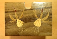
Here are a couple of photo's of the finished piece. I'm very pleased with the marquetry side of things, though wood grain choices still need more thought, but I'm still struggling with the polishing process. The shine isn't as shiny as I wanted, nor as even. Much more practice and learning is needed in that regard.
Previous posts on Marquetry


Absolutely beautiful!
ReplyDeleteThank you very much Judy and how lovely to see you here.
DeleteOh John this is a gorgeous piece. What a project and I am so glad you shared your thoughts on the gray scale. Tonal values are always such a test for me. Good tip to make a black and white of the photo. P.S. I especially adore Daffodils. Hugs!
ReplyDeleteI think tonal values are a test for us all, but a greyscale photo really helps a lot. Thank you very much Debbie.
Delete